AT

Alexandra Tragut

evulpo Class Hub Dashboard
Helping teachers identify their next action
evulpo is an online learning platform primarily offering content for students in lower secondary education (Sekundarstufe I, grades 7–9 in Switzerland). Originally developed for individual learners, the product gradually shifted its focus towards schools.
The Challenge
The existing dashboard required teachers to piece together student progress and recent learning activity across separate areas of evulpo. Informed by usability testing and teacher interviews, the redesign aimed to help teachers find relevant information faster and better understand their students’ learning activity.
My Role & Scope
Role: Primary Product Designer (Collaborating with 2 Developers and CPO)
Timeline: 6-Week (research & design) + 6 Weeks for development, Shipped September 2026
Process: End-to-end ownership (Research, flows, information architecture, interaction design, prototyping, testing, visual design, and partnership with product/engineering.)
Existing Dashboard & User Research

Existing Dashboard
Released in October 2025, the previous dashboard supported evulpo’s transition from a product for individual learners to one also serving schools. I was the primary designer for this version.
As stakeholder requests and feature highlights accumulated, the dashboard became crowded and its information hierarchy less clear. Subsequent research helped us identify which elements teachers found useful, such as students needing support, and which needed clearer context, such as the topic-engagement chart.
User Research and Usability Testing
My research partner and I conducted ongoing research with 10 teachers over nine months, starting in November 2025. Participants included both experienced and new evulpo users. We shared responsibility for recruiting participants and took turns moderating sessions.
The research primarily focused on validating changes to Learning Paths and understanding how teachers used evulpo in the classroom. Sessions included interviews and think-aloud usability testing, during which teachers described their thoughts as they used the platform. These sessions revealed navigation difficulties, including issues relevant to the dashboard. During school visits, I also showed teachers the existing dashboard and discussed it with them.
Although this research covered the broader platform, it surfaced three findings that informed the dashboard redesign:
1. Teachers’ information needs changed throughout the teaching day:
Teachers approached evulpo differently when preparing lessons, teaching in class, and reviewing activity afterwards. The existing dashboard combined information for these contexts without a clear hierarchy. This prompted me to explore how to organize information around teachers’ tasks and classes.
2. Learning data lacked context:
The dashboard highlighted students who needed support and time spent learning, but did not provide enough detail to explain where students were struggling. Teachers needed to identify the specific Learning Path and Exercise Set behind a low score.
Teachers also sometimes gave instructions verbally rather than creating assignments in evulpo. They therefore needed visibility into students’ learning activity beyond formally assigned work.
3. New users struggled to understand what evulpo offered:
Despite the available introductory modals and navigation tooltips, new users could arrive at the dashboard without understanding the platform’s learning content or student insights. This highlighted a need for clearer guidance on getting started, tailored to different teacher entry points.
The Design Process
First design explorations
I explored two approaches to organizing the dashboard: tabs for different teaching contexts and a single page with distinct groups of cards.
Separating preparation, in-class use, and administration into individual pages would have resulted in sparse content or duplicated features, given the functionality available at the time. I therefore moved towards a shared overview that could support several teaching tasks.

Tabs by teaching context
Grouped cards on the page
Organizing the dashboard around each class
Teachers could manage multiple classes and typically planned lessons and reviewed students within the context of a specific class. I therefore chose class tabs as the dashboard’s primary navigation, with subject and date filters to narrow the information shown.
Within each class, I grouped content around three teacher questions:
-
Who needs my attention?
-
What have students been working on?
-
What should I teach next?
Tools and new content were placed in a separate Resources tab.

Final Dashboard Design
Deciding What to Show First
Workshop: Prioritizing Information
I facilitated a team workshop to explore the dashboard’s information hierarchy. We focused on what teachers needed to see immediately and what could be revealed as they explored further.
The existing dashboard presented too much information without a clear hierarchy. The workshop explored how to give teachers enough context to identify a concern while keeping detailed results accessible. A central question was how teachers could move from noticing a low score to understanding the exercise or question a student had struggled with.

Workshop exploration of dashboard information and deeper detail
Exploring Different Levels of Detail
I initially explored minimal layouts that emphasized summary metrics. However, these designs would have required teachers to navigate further to understand the activity behind the numbers.
To balance a concise overview with access to context, I moved towards summary counts with expandable sections showing supporting details.

Exploration B: Metrics with supporting context
Exploration A: Summary metrics
Final Card Designs
These explorations led to a card structure that pairs an at-a-glance summary with expandable context and links to detailed results, organized around teachers’ key questions.
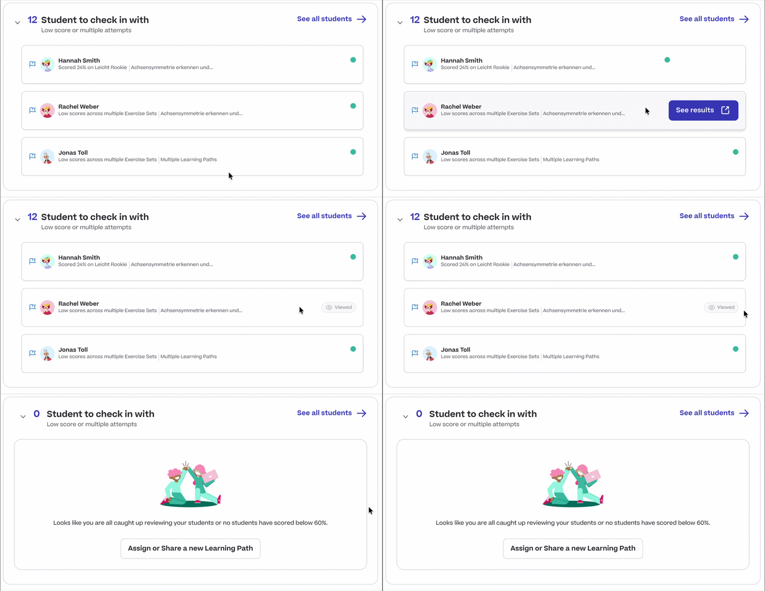
Who needs my attention?
This card surfaces students with Exercise Set scores below 60%, ordered by their most recent activity. Teachers can open a student’s results in a new tab to investigate the difficulty while keeping the class overview available. A “Viewed” label indicates which student results they have already opened. If no students scored below 60%, or a teacher is all caught up in review a celebratory state is shown.

How is my class doing?
Class Pulse brings together active student counts, learning minutes, and average scores by exercise difficulty. It gives teachers a starting point for reviewing participation and performance, with access to detailed activity when they need more context.
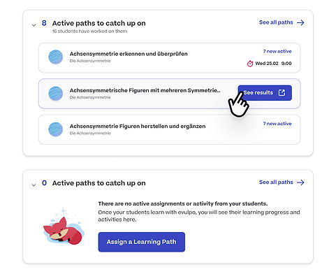
What are students currently doing?
This card brings together recent activity across assigned Learning Paths and paths students access independently. Including both reflects how teachers work: some create assignments in evulpo, while others give instructions verbally. Teachers can open the results for a path to explore the activity in more detail.

What should I assign or teach next?
This card presents suggested Learning Paths for teachers to review when planning their next lesson. Recommendations are based on text book ordering and the most recent assigned path or active path from students. When suggestions are unavailable, an empty state explains how to get started.
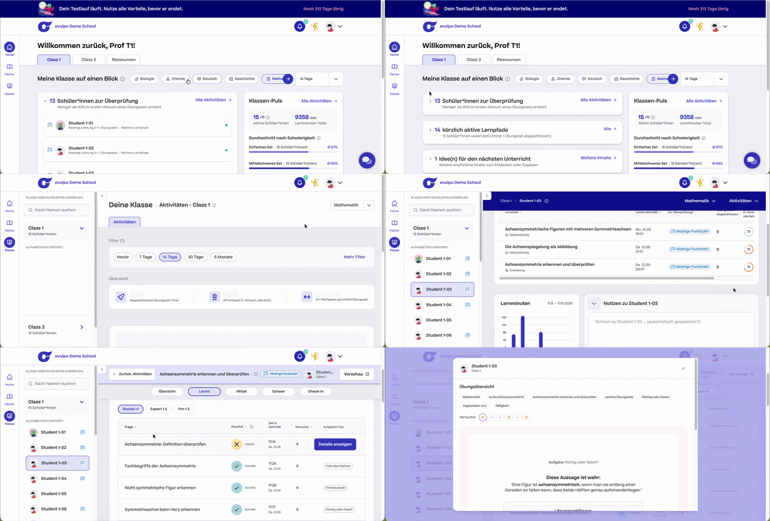
From a Flagged Student to Detailed Results
The flow connects two teacher questions: “Who needs my attention?” and “Where are they struggling?” Starting from Class Hub, teachers can open a flagged student’s results and inspect the relevant exercise details. This provides context for a follow-up conversation with the student.
Helping New Teachers Get Started
Research showed that new teachers could reach the dashboard without understanding what evulpo offered or how to begin. I designed an onboarding checklist with direct links to introductory tasks and visible completion states.
The checklist differed for teachers joining through an onboarded school and those signing up independently. School-onboarded teachers were guided towards trying and assigning a Learning Path, while independently registered teachers were prompted to add their first students.

Teachers joining through a school
Teachers signing up independently
Teacher Resources
Teachers also needed access to supporting tools, including student password management, introductory guidance, and newly published Learning Paths. I grouped these in a separate Resources tab to keep them accessible while keeping the class overview focused on student activity and follow-up.

Release Scope: evulpo Administrator Overview
evulpo administrators needed an overview of platform usage, including those who were not themselves teachers. Within the release timeline, the team prioritized the teacher experience and retained the existing administrator metrics in a dedicated Admin tab. Improvements to this overview were deferred to a later release.

Going Forward
Takeaways
What I learned: This dashboard update was a huge technically as well as design wise. I learned that prioritizing key features by technical and user impact for the first release round was important. With the tight timeline and changes we wanted to implement, refining the features could be put to a future sprint. I also learned that you cannot think of all edge cases and that through testing these edge cases will also be revealed. Adapting the design to capture these edge cases is imporant.