AT
Alexandra Tragut
evulpo Student Performance

The Challenge
B2School Expansion To support Evulpo's entry into the B2School market, we needed to empower teachers to assign lessons and visualize student performance data. The primary design challenge was balancing deep data granularity with UI simplicity, ensuring teachers could quickly assess student competencies.
My Role & Scope
Role: Primary Product Designer (Collaborating with 2 Developers)
Timeline: 8-Week intensive sprint
Process: End-to-end ownership (Discovery, User Studies, Final UI)
Deliverables: A complete overhaul of the Student Activity module and the creation of a new Assignment & Performance Dashboard.
Discovery & Problem Definition
The discovery phase focused on mapping the teacher’s mental model to our product's technical constraints. I investigated how teachers currently track progress to ensure the digital workflow felt natural and not administrative.
My research highlighted two primary user needs:
-
Assignment Oversight: A clear view of active assignments, including completion status, due dates, and assignees.
-
Performance Tracking: detailed metrics that visualize both unit scores and completion rates.
Streamlining the Teacher Workflow
Teachers needed a way to assign content without breaking their flow. I introduced an "Assign" feature via a modal window, enabling users to configure key details—such as deadlines and student groups—without leaving the lesson overview page.

Lesson Page
Learning Path
Assignment Modal
The Assignment Dashboard
I designed a centralized hub for teachers to manage all active and past assignments. The initial layout focused on administrative control, featuring date filtering and direct access to assignee details.

Assignment Page
Notifications
Initial Designs
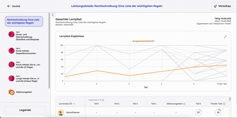
Teachers required a drill-down view of performance; starting from the high-level Learning Path and zooming into specific Units and Question Attempts.
A major point of uncertainty was how to calculate "success." We debated whether a student's grade should reflect their first attempt (baseline knowledge) or their final attempt (mastery after practice). Additionally, we needed to validate if statistical metrics like "Error Rates" were easily understood by non-technical users. To answer this, I iterated on two competing layouts to present during user testing.
Learning Path Overall

Version 1
Version 2
Unit

Version 1
Version 2
Redesigning Student Competencies
The existing graphics on the Student Activity page were confusing and did not answer the teacher's primary question: "How well does this student know this topic?"
.png)
Existing
Iteration for user study
Validation & Iteration
Following the initial prototyping phase, I conducted qualitative usability sessions with four teachers to test the navigation flow and information hierarchy.

Translating Insights into Final Designs
Synthesizing the feedback from our teacher sessions, I moved to high-fidelity designs with a focus on three key areas: reducing negative friction, improving data visualization, and clarifying student competency.
Insight: Teachers value viewing student details, like number of attempts and how the student answered the question. Visualising this is easier to understand.
Decision: Reduced Negative Friction. Replaced static red text (which teachers felt was discouraging) with interactive hover states.
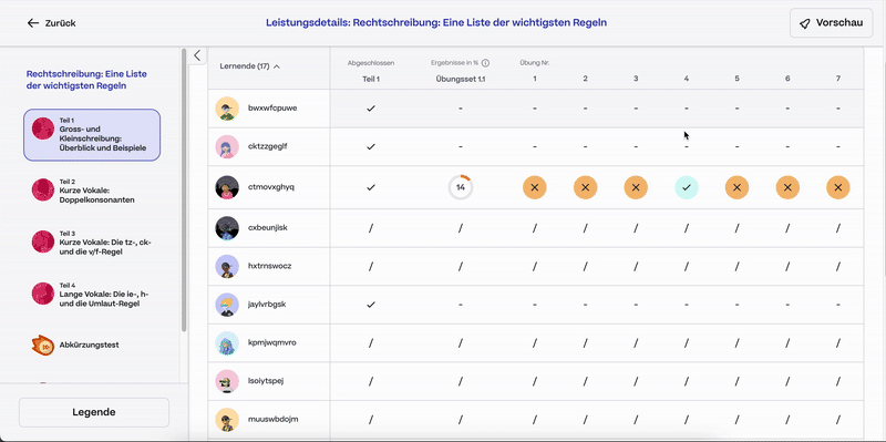
Insight: Graphs are valued to easily see where a student progressed and error % are understood and a useful metric.
Decision: Create a graph to understand student attempts (error %) to grade of the unit.
Insight: An overall status overview of all students' strengths and weaknesses is needed.
Decision: I redesigned the interface to clearly visualize Student Standing per Topic, prioritizing the "Competency Breakdown" that teachers requested during earlier research.

Final Screens

Performance Overall Path
.png)
Performance Unit
.png)
Competencies
Activities
Going Forward
Takeaways
Teacher Quote:
"The performance overview provides an easy way to view how my students are progressing on an assignment an assignment"
"I can easily see where my student's stand with specific competencies, it's a great overview I can share with parents."
What I learned: This was my first major feature I independently worked on and led. With such a tight timeline, I would of in hindsight focused on a first round of user studies with low-fidelity mockups. This way I could establish all the required data needs from teachers first. In my following project, I implemented working in a low-fidelity state earlier on to improve this process.
I would like to do another round of user interviews to further see if any usability issues came up or any other data points are needed from a teacher's perspective.