AT
Alexandra Tragut
Migros Fitness App

Overview
1. Project Overview
2. Migros Branding
3. Redesign of the App
Project Overview
I redesigned several screens of the existing Migros Fitness App to give the app a more modern feel and be in line with the existing Migros branding. I added a key feature of a capacity calculator to allow users to see when the best time to avoid crowds at the gym would be. I also updated and streamlined the class booking user flow to allow users to more easily book and cancel classes.
Problem: The gym can be sometimes extremely crowded and makes working out stressful, especially when one has to wait for machines. Booking and canceling gym classes through the app shouldn't be a difficult process.
Goal: Redesign several screens for an existing fitness mobile app to improve the class booking process and integrate capacity information and a calculator to figure out the best time for users to go to the gym.
My Role: UX Designer redesigning a mobile app. I developed high-fidelity wireframes, clickable prototypes and user flows to enhance the app experience.
Project Timeline: January - February 2023 (3 weeks), project completed in Figma.
Migros Branding
Research
The iconic Migros brand color is orange with bold san serif font that gives a younger and fresh feel. The mobile application and web experience for the grocery store has a clean layout with accents of the iconic orange through text.

The application and web experience for the Migros Fitness Park feels disconnected to the main overall branding of the Migros grocery store and the other applications provided through Migros. The Fitness Park website provides information on how many visitors are currently using the gym but the number is hard to put into context of how and where is it busy. This information is not provided in the application. The current application was missing the menu bar navigation on several screens and could benefit from a few updates to make the user experience better.

Redesign of the App
High-fidelity Mockups & Prototype
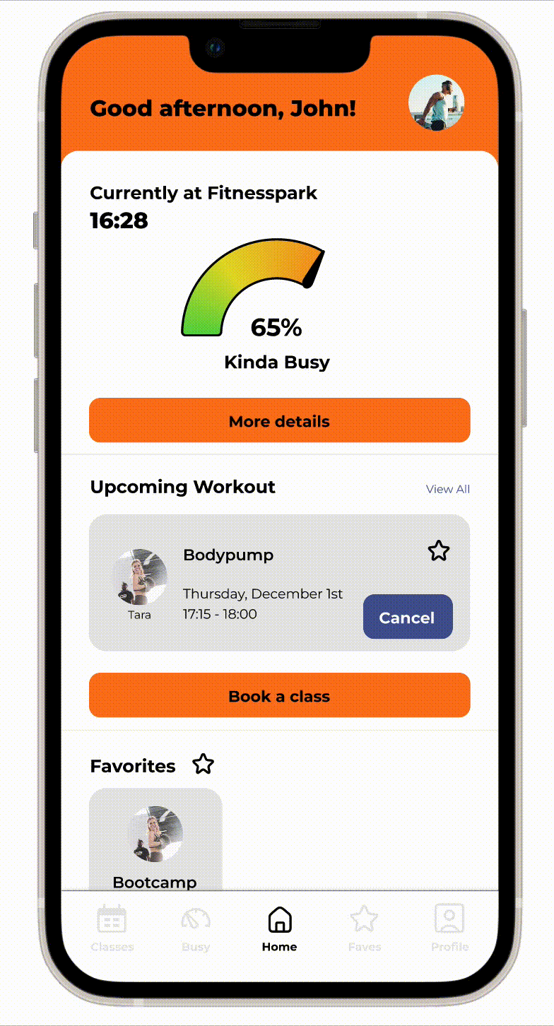
Homescreen
The current design of the app does not include upcoming workout reminders and has limited information that is helpful to the user. The training plans advertised are not as beneficial as a separate online program and could be located in another tab. The latest activity although a great idea never seems to work or show your latest classes. In the redesign I focused on adding information about how busy the gym is and upcoming workout reminders and favorites. The capacity information is then available as a heat map for users to see where the busiest sections of the gym are.


Prototype: Capacity Calculator
This additional feature available from the homescreen would allow users to better understand the number of visitors which is already provided on the website experience. A heatmap showing the division of gym-goers would help the user plan their visit. A calculator to figure out the capacity at a future time is also provided.
Classes and Booking
The current design of the class booking has only a back button navigation and requires several steps to books a class. For the redesign I focused on the addition of bottom bar menu access and modernizing the class booking by adding instructor photos and the option to add classes to favorites. The steps to book a class has been simplified for the user in the redesign.

Current Design: User Flow Class Booking


Redesign Prototype: Class Booking
The user flow for class booking has been simplified.