AT
Alexandra Tragut
Kunst Gallery

Overview
1. Project Overview
2. Understanding the User
3. Starting the Design
4. Refining the Design
5. Responsive Design
6. Going Forward
Project Overview
The Problem: Visiting art galleries and discovering artists can be dependent on one’s location.
The Goal: Design a mobile app and responsive website to allow users to virtually tour and view art from anywhere.
The Product: A mobile app and website for desktop and mobile that allows visitors to virtually tour an art gallery, view and receive information about the art. Users can contact the gallerist regarding purchasing artwork.
My Role: UX Designer working on the project from conception to delivery including the following responsibilities:
conducting interviews, paper and digital wireframing, low and high-fidelity prototyping, conducting usability studies, accounting for accessibility, and iterating on designs.
Project Timeline: April - August 2022. Mobile application completed in Figma, responsive website completed in Adobe XD.
Understanding the User
User Research
I conducted interviews and created empathy maps to understand the users I’m designing for and their needs. A primary user group identified through research was art lovers who hadn’t visited a gallery in long time due to time restraints or travel restraints.
This user group would be interested in discovering new artists and artwork. They also expressed interest in possibly purchasing art but were intimidated by the typical art gallery model.
Pain Points
1. Access: Art lovers are constrained by a gallery’s location or opening hours. Discovering new art requires one to be in person.
2. Purchasing: Purchasing art through the typical in person art gallery model can be intimidating and is not always transparent.
3. IA: Information regarding art is text heavy and not accommodating to the visually impaired
Personas

Melinda is a busy working art enthusiast who needs an easy way to discover and view art from home because she recharges through learning about art and new artists.
Katherine is an art collector who needs an easy way to discover and contact artists because she is interested in expanding her art collection.

Starting the Design
Storyboarding

Wireframes & Low-fidelity Prototype
Through multiple iterations of the home screen, I explored the placement of different elements and how they would best address the user. I prioritized the virtual tour and current events by having them be visually in center and largest on the screen


Paper Wireframe Variations of the home screen
Final Version
As the initial design phase continued, I made sure to base screen designs on feedback and findings from the user research. Contacting the artist regarding questions and purchasing was a key user flow.

Homepage

Contact page

Art Info Page
User Testing Round #1 Findings
conducted two rounds of usability studies. Findings from the first study helped guide the designs from wireframes to mockups. The second study used a high-fidelity prototype and revealed what aspects of the mockups needed refining.
1. Contacting the artist is difficult
2. Language in app is confusing
3. Navigation through app is difficult
Synthesising the Results
Using an affinity diagram, I organized the research results into specific categories.

Refining the Design
Mockups & High-fidelity Prototype

Before Usability Study #2

Artwork Page
The contact button was hidden with an expandable Art Details page. I revised the design to have the contact button easier to access and visible from the Artwork page.
After Usability Study #2
Contact Page
The contact button was hidden with an expandable Art Details page. I revised the design to have the contact button easier to access and visible from the Artwork page.

Before Usability Study #2

After Usability Study #2

Prototype: Virtual Gallery
A main user flow is the virtual gallery and viewing information regarding the art and artist. Feedback from usability study #2 was that art is not intuitively clickable during the virtual tour. Another piece of feedback was that the navigation arrows in the virtual tour are not prominent enough.
Prototype: Contact Page
Contacting artist vs. gallerist is confusing

Prototype: Menu Navigation
Contacting artist vs. gallerist is confusing
Final Layouts

Responsive Design
Sitemap
Easy website navigation was my main goal regarding the information architecture for the overall website. The structure I chose was designed to make things simple and easy.
.jpg)
Wireframes & Low-fidelity Prototype
Through multiple iterations of the home screen, I explored the placement of different elements and how they would best address the user. I prioritized the exhibits and virtual tour.


Paper Wireframe Variations of the home screen
Final Version
Mockups & High-fidelity Prototype
Gallery Information
Early design had the user flow to contact the gallerist several clicks deep from the gallery information page. Based on insights from the usability study, I revised the design to have the contact button available on the gallery information page.

Wireframe

Hi-fi Mockup
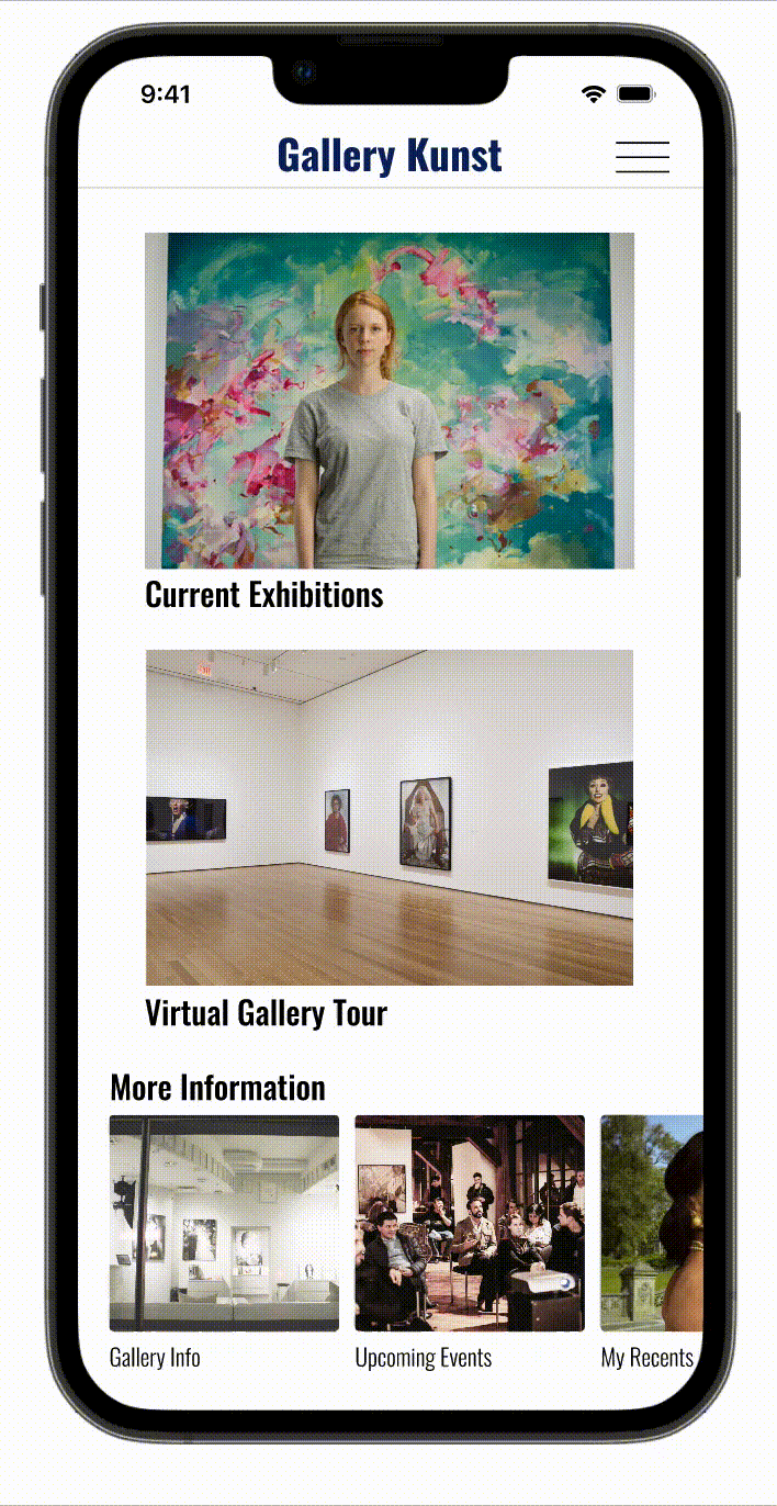
Homepage
The homepage layout for mobile and desktop design focused on clear imagery of current exhibits and easy access to the virtual gallery tour. Contacting the gallerist was added through the home page as well.


Prototype: User flow & navigation
Accessibility Considerations
I focused on the following design items to make the app more inclusive:
1. Provided audio for heavy text summaries for users who are visually impaired.
2. Used icons for easy navigation
3. Reviewed color and contrast for text with WCAG.
Going Forward
Takeaways
Impact: The mobile app and website make it easy for users to visit an art gallery anytime or from anywhere. Users can easily learn about art or listen to audio or video.
What I learned: Throughout the project I wanted to redefine how art is purchased, I quickly realized that was my own personal goal not necessarily a user pain point. After conducting the second round of usability studies and speaking with an art owner I reframed the contact and purchasing approach. Consistently receiving feedback and putting users ahead of your own goals in the design process is important.